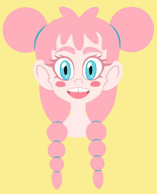
A rough design of 'Bubblegum'
So after I finally figured out what I would be focusing on for my studio work project after a long period of brain storming and before I start doing any research into my chosen theme I decided to produce a sketch of what one of the characters could possibly look like just off the top of my head in order to get the ball rolling and get down my initial design ideas.
I started off drawing out the design of one of the character I thought about as a initial design since deciding what my project was going to be which was the character 'Bubblegum'. Bubblegums's personality is meant to be happy, bubbly and friendly so I had these as a good starting point to their design as well as the idea that they are meant to represent that sweet itself so I decided to just work off of these initial ideas and see what I got. My final pencil sketch can be seen in the image below.
Drawing this character was basically just for my own benefit to try and help solidify my ideas and see if I could get a good first initial design from the theme I am deciding to work with. I know for this project I want my designs to be a combination of both cartoon and anime, which is what my usual character design work consist off as it is two things I really love and so this was something I was baring in mind whilst drawing. I had had some initial design ideas when I first thought up the concept of this character which I really wanted to try and draw to see what it would look like. For example I wanted their hair to actually be made of bubblegum so it would have a gloopy look to it and possibly including having circular spheres incorporated into it somehow to make it look like blown bubblegum bubbles.
So with this pencil sketch complete I decided that it maybe fun for experimentation to scan the drawing in and have a go at painting it in Photoshop in order to have a little play with colours and to try and see if my idea of matching core emotions with core colours and facial expressions was going to work. I initial did some very brief image research on the candy Bubblegum just to get a feel for the colour scheme that is used which is mainly highly saturated pinks and blues so these were shades that I knew I needed to incorporate into my designs. The colour pink was going to be my main colour though as it is the shade is the most recognisable for bubblegum.
So once I had had a look some quick image research and references to do with Bubblegum, I scanned in my character design sketch and imported it into Photoshop. I decided to, as I had been practising not using solid black outline in my pieces recently, to continue with this theme and just work in blocking out the different colours for the character instead of spending forever on completing an outline. Seeing as this is a practice piece anyway I knew I didn't have to go into shading either which made things a lot simpler and quicker to do and also allowed me to have a little practice with the style of vector that my tutor Nigel and I had spoke about my possibly looking at in the beginning stages of idea development. My block coloured version of my scanned in sketch can be seen in the image below.
I tried to incorporate both of the well known bubblegum colours into this design, with pink as the predominate shade, in order to really try and get across what the character was and I found that this colour combination worked really nicely in order to make her fit into the bubblegum theme but I also felt like something just wasn't quite right with the design as a whole. I wasn't interiorly happy with how I had drawn the hair on the top of her head as It just looked like it was lacking something to me personally so I decided that I needed to change it from what I had drawn in the original sketch. When I was roughly sketching out a possible new hairstyle in Photoshop I suddenly had a design idea that may fit the characters theme perfectly.
As I am going for an anime influence in my character designs and I wanted this character to have spherical shapes in her hair to represent bubbles, which I had already incorporated in her plaits, I decided that I should give her ridiculously huge buns in her hair. This way it would give the piece a better sense of symmetry and really help to bring across the idea that she is meant to represent a certain type of candy as the buns in her hair end up looking like blown bubblegum bubbles. Below is my final practice character design for Bubblegum with the redesigned hairstyle alongside a alternative image I used to post on my Facebook page.
For a beginning design to get the ball rolling and just have an experiment with my theme I am pretty pleased with how this piece has turned out as it has really captured the typed of style I would love to work in. But obviously I am not setting the art style in stone as I will have a lot of experimentation work to produce of different types of design styles once I have started looking at artistic and game influences. As well as doing this I need to do a lot more more research on different types of sweets and candy which is going to be the next part of my studio project that I need to begin working on.


No comments:
Post a Comment