Sunday 17 November 2013

Final Pieces for Environmental Studies


These are my two completed final pieces for environmental design. I didn't want my pieces to be typical sunny, green grass and lots of stereotypical summer colours so for the second piece I decided to go for a early autumn setting with a sun starting to set to help give the piece a richer environment. The first piece is set at dusk were the fire is now bright enough to help light up areas of the village. The glowing lights are meant to be fireflies but I also think it looks like the first glimpse of winter with the snow starting to fall so it can be interpreted either way.
 
I'd like to note that this was my first time colouring pieces of Photoshop and my first time not using line art so for a first attempt I am very pleased with them! The first image is my favourite as I feel it has a lot more depth to it and I just prefer the setting and lighting.  I am feeling more comfortable with using Photoshop after these two studies and it's good to know I can only get better from here.


Monday 11 November 2013

Quick sketches and the value/colour studies


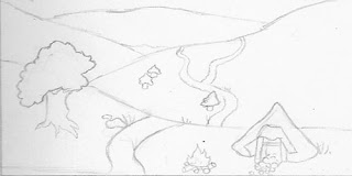
These are the 4 quick sketches I completed. I knew that my era wouldn't have a lot of image references as to what it might have looked like but I decided to look into different environments were tribes could have settled. This mainly features mountainous area with nearby water source or ground with fertile soil to grow crops.
 
As I find environments difficult and have never attempted to draw any before I really depended on my image reference. So I used the basic layout of the environment and then added objects to make the landscape seem inhabited.


I then started working on my value studies working on basic shadowing on the landscape. I didn't want to add a lot of details as many of the landscape were quite desolate and plain and also this way I am able to see where the colours need to go and how dark they need to be. The three top images are based in the day time but for the last one I wanted to work on night-time scene were the fire was the only source of light.


After finishing the value studies I moved on completed the colour. I quickly put which colour I wanted each object to be which has really helped me picture how my two final pieces are going to look. My personal favourite is the second down from the top, I was going for a autumn theme as I thought it would be nice to show a iron age environment that had splashes of prominent colours instead of dull greens and browns.


Lecture based written work

Brief lighting analysis


The first piece I decided to study on was a digitally painting environmental concept created by the Deviant Art member K-atrina. You can tell that the main light source is the sun which could be shining through higher branches of trees of partings in the clouds as you can clearly see sun beams shining down in front of the main focal point which is the tree. I believe that the background that is just to the left of the tree would be slightly darker due to the lack of lighting catching it. I also think that the area in the foreground with the red gateway would be slightly lighter as I feel it is too shaded and doesn’t mix well with the rest of the piece. On a more positive note the colours used makes the piece look soft and this is also helped by the subtle lighting dotted around the environment. Even though it is not a ‘clean’ piece, the lighting should still try and be as accurate as possible which they have achieved quite well.  


This is a classical painting by Charles Joshua Chaplin. Overall I think the lighting and shadows are very accurate and I imagine the artist had a life model in front of him whilst creating this piece so he had a reference to perfect these elements.  The main light source is clearly shining directly onto the young girls face and upper body so it must be directly in front of her at quite a close distance but not enough to create very heavy shadowing. If this is the case then there should be a darker area were her shadow is hitting the background but it just seems to change gradient from the middle to the edge with no sign of stronger shadowing. Then again we don’t know how close the background actually is to her, she could be right up next to it or a few feet away so this would alter the amount of shadow created.  

Thursday 7 November 2013

References for environmental studies


I decided to make a little collection of photographs I could use for reference when I am sketching out my environmental designs. I first collected images of the Iron Age British houses as I knew they would be a key part of a environment during this time. I then went a found images of possible locations that the houses could be situated.


Final Piece


This is my completed image for my final piece. After finishing the main image I did some image research for the background, mainly looking at Iron Age houses as I wanted her to be inside her room of the cooper tower. I noticed that the houses were very basic and didn't have a lot inside and I figured as she is a convicted criminal she wouldn't have many luxuries, furniture being one of them.

I wanted the background to show were she is but at the same time not be detailed enough to distract from the main image. After sketching and colouring the background and then moving the figure to fit the image I added in a severed arm to help portray the violent act she had just committed. It also conveniently helped the floor look less plain. 


Wednesday 6 November 2013

Development of Final Piece


After completing my model and character sheets, I moved onto my final piece. I knew exactly how I wanted her to look and used a website called 'posemaniacs.com' to pick out a pose that fitted her personality. I have uploaded the different stages throughout my process of creating the final image. 
 
 
1. This was the initial drawing I did in my sketch book after studying a pose from 'posemaniacs' and tweaking it slightly so that it would work with what I wanted her to be doing. I feel very comfortable sketching and a little out of my comfort zone working digitally but I think I am improving little by little.


2. After scanning in my sketch, I transferred my drawing onto 'Manga Studio Version 4.0' which is, to be honest a very basic version of Photoshop but it has a great function for creating line art and this is something I do often.


3. After completing the line art I simply added the base colours for my design so that I could make sure the colour combinations I had chosen worked well together over all. After asking peoples opinion of appearance, ginger with green eyes was the favourite so I have applied this in my design.


4. I then went on to shading my piece to give it more depth and character. This was the longest part of the process but it was worth it in the end. I am pleased with how the tartan skirt and hair turned out. I wanted to keep her the centre of attention so I used duller colours for the decapitated head which I think had worked well.


5. Finally I went over my shaded piece and added in little details to increase the characters appearance more and fit to her personality. I added bruises, cuts, blood to her weapons and muddy patches to her clothes and feet portraying her rough and barbaric state of mind.


Now that I have completed the main figure I will start working on a background to place her in. I am researching into Iron Age houses at the moment and I am thinking or putting her in her room which resides in the copper tower. This way I can add some interesting elements into the background so there is something else to look at.