Monday, 29 February 2016

Continuing with my candy based project

Doing a initial style practice and colouring test 


Once I had finished planning out what kind of body shape I wanted for my characters as well as doing a little bit more of my own personal drawing again and also revising all the different character ideas I had thought up in BA3a, I thought it would be a good idea to keep my creativity flowing and just continue with getting some more work done. As I have been feeling motivated to do some more artwork digitally as all my more recent pieces have been drawn onto a tablet and I have been really pleased with how they turned out I decided that, just to get the ball rolling, I would have a go drawing and colouring one of the candy based characters I had planned out so that I could use my chosen art style and colouring technique just to see what it would look like as a finished piece and to see if I needed to make any tweaks to what I had chosen.

I actually did this previously at the beginning of BA3a to help me get me get my project kick started and so that I could properly visualise the type of look I am aiming for so I just decided to have another crack at this again and just draw out the same character I chose before to see how far my idea has progressed. This and also because I am really excited about my project and I just really wanted to draw one of the character designs I have had stuck in my head for a long time now as I am pretty passionate about it. I have popped the piece I did last term down below as well as the new piece I have just finished so that you can see the small progression of my character Bubblelina.


My original design idea


Experimenting with my chosen art style and cel shading


Although this was just a fun little experimental piece I wanted to do before I actually started focus properly on my characters features like her clothing, hair style and set colour scheme might be I am pretty pleased with how this has turned out.  I am really enjoying drawing digitally at the moment, ever since I got the programme Paintstorm Studio really as I find that it is so much smoother and nicer to use for drawing than Photoshop is, however, that being said they are both compatible with each other so I can open my files in each and I usually end up doing my colouring in Photoshop so I use a bit of both. Although I am slowly getting used to doing some more stuff digitally I have also been craving to go back to pencil and my pro markers so I might have a go at that to do some more sketchy stuff later on. Either way this was just a bit of fun to see how my art style would look as a final piece and I have to say I am really pleased with it so I am going to continue down this route design wise. 


Sunday, 28 February 2016

Developing my characters a little further

Thinking of potential names 


Now that I have been starting to focus more on the design of my candy based characters I thought a good thing to do would be to have a little review of the ideas I had had in BA3a about what I was planning to do character wise and how my ideas have progressed. So all my different characters are based off a type of sweet, almost like personifications of them if you like, and I have been shaping their individual personalities with what I personally believe a living representation of the candies I have chosen would be like which has been a lot of fun to do. Overall, in my head I have been able to visual my characters pretty well so far so now that I have thought about them I just need to start implementing that into my design work really. I have popped a little reminder of what I had been planning for my characters in BA3A down below which is things like what their chosen sweet is, what their personality is like and the colour palette I had made for each of them using photographs of the chosen candy as reference. I have to say thinking of different candy inspired characters wasn't as easy as I thought it would be as there weren't as many workable options as I thought as I started to look a different types of sweets but I am pretty pleased with these finalised concepts so far.


Chocolate 
relaxed, smooth and calm


Bubblegum 
bubbly, friendly and positive


Liquorice 
moody, negative and quiet


Marshmallow 
soft, gentle and kind


Mint 
mart, neat and sensible


Popping Candy  
hyper, energetic and vocal


Sour lemon sweet 
bitter, rude and sour


Although I now have a very clear idea of what I want to try and make my characters all look like design wise, the one thing I have been struggling with a little bit is trying to think of their individual names. I already know that the game I want them featured in is called 'Pick & Mix' but as for the actual names of my characters I was stuck trying to come up with something for a little while. This is always a part of the design process that I kind of forget about and then when someone asks me what the character I have just drawn name is, I go blank but thankfully I was finally able to come up with something. I've decided that I might be a nice idea to incorporate existing names into the names of the sweets I have chosen for each of my characters so, for example, If I was designing a female character based off a lollipop I would call them Lolapop. I few other examples I had was, Bellascotch, Candicecane and Carymel. I just thought this might work well so I had a little brain storm and gave it a try and the finalised character names I came up with I have posted below in a font that helps represent their personality. Admittedly I couldn't think of a single thing that would work for Popping candy, it was really hard trying to incorporate a name into that and so, for now, he will be referred to as PC. I am pretty happy with these names as I think it suits what I have planned for my characters so now I just need to get on and draw them. 


Friday, 26 February 2016

Still feeling motivated to keep on drawing

Another piece of  'Welcome To Hell' fan art 


Well I think the title for this blog post really does sum everything up but I still feeling really inspired to keep drawing at the moment and just riding the creativity wave because who knows how long it is going to last. It has been really nice feeling motivated to get some art work done as I feel like through BA3a I was in a bit of a slump and wasn't getting a lot done which made me feel a bit down but now I am feeling so much more positive about the art work I am producing stuff so I am just going to keep on producing it, whether it is fan art or not, because I just feel like it right now. The character I have drawn this time is, once again, from 'Welcome To Hell' because I adore that animation and I wanted to play around with drawing a more apathetic looking expression so here it is.


Wednesday, 24 February 2016

The fifth anatomy workshop

Looking at a few of the thigh muscles 


So I had another anatomy model making class today where this time around we continued focusing on the lower half of the body, so the legs but we moved on from working on the bones and had a go at adding some more of the muscles on instead which was nice to do as all of our skeletons were looking a little bare. We specifically worked on sculpting some of the larger muscles which can be found in the thigh and Ron told us, whilst using his own models for demonstrations, what each chunk of the thigh did and how it effects the rest of leg. I have popped a visual example I found online with some basic labelling on it in case I want to refer back to it when I am doing an anatomy drawing.


An example of the area we were modelling


This week instead of using the typical white wax we have been using to sculpt the bones, we were introduced to a new black wax that seemed almost more like clay than anything else as it was so soft. It has a much lower melting point than the white wax does and so it became soft very easily when put in the boiling water but overall I found it was actually much nicer to shape and mould with so I was able to make the shapes of the muscles that I needed quite easily. We were able to use as base image that Ron made for us to size up the muscle to make sure it would be the right size before we applied it to our skeleton which made things simpler as well. The we had sculpted the main thigh muscle in black wax we moved back to using the orange wax we had used in previous weeks to add another part of the thigh muscle that can be found on the back of the leg. I have popped a few photos of how my model progresses through this weeks session below so you can see the new elements I had sculpted.


Monday, 22 February 2016

Working on my character designs

Thinking about body shape 


So as I am now completely stuck in a creative mood and have been for a good few weeks now, drawing little and pieces of fan art here and there I thought it would be a good idea to get cracking on drawing my candy based characters and put my personal work on hold for a bit. I thought a good place to start off would be by having a look back over the art style page I had made previously to see how I could further my art style choice. I also had another look at anime mood boards I made  previously and the mood boards I had made way back at the beginning of BA3a that were a collection of digital pieces and character designs that I really liked for a little bit of inspiration.

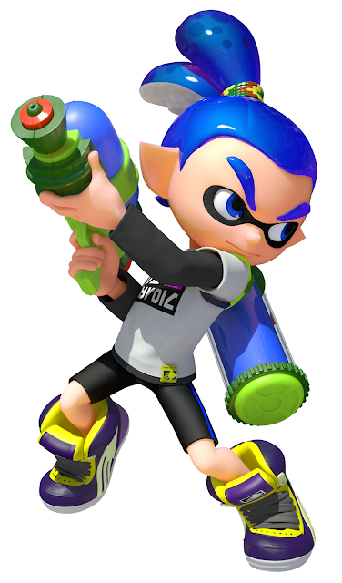
After looking these over, I had a pretty clear idea of what kind of art style I wanted to go for, which is cartoon/anime looking and I thought a good place to start the design process of my making my characters would be to try and get their anatomy and basic body shape down first.  I had a little go last term at drawing some different types of anatomy using shape theory which I had studied which turned out okay and It gave me a few examples of what I could possibly go for, however, I have had a strong idea from the beginning of how I want my characters to look proportionately. I had been   inspired, right a the beginning of my project, by the look of the characters in the Nintendo video game 'Splatoon' and I knew that, if I could, I would like to try and capture a similar look to what they had were the body is the smallest part of the character and their head, hands and feet and a little oversized. This is actually quite similar to the 'chibi' art style which can be found in anime so I thought this would be a good theme to go with. So whilst I had a look at the 'Splatoon' video game characters anatomy I also had a look at others that I thought were similar for some inspiration and I have popped them below.


Inklings from 'Splatoon' 


Playable characters from 'Disney Infinity' 


Vanellope and Taffyta from 'Wreck It Ralph' 


I really like all the body shapes from the characters above as they all have a similar feature where the head is over sized, making them look a lot more cartoonish and cute in a sense and this is certainly something I really want to capture in my own characters. So with some good example I could look at for inspiration I decided to have a go at drawing out the body type that I would like my characters to have. What I really liked about the 'Splatoon' characters is that they all have the same body type, obviously with little tweaks here and there to change the gender but overall, they are all identical and what is different is the accessories, hair and clothing and this is also a similar with theme with the 'Sugar Rush' characters in 'Wreck it Ralph'. The biggest visible differences are when it comes to the characters actual design and expression.

I really liked the idea of keeping sort of a set structure when it comes to the anatomy of my character and only changing little things when it comes to height or something as I thought it would allow me to focus more on expression, body language and clothing then focusing too much on body shape so I decided to give drawing something like this a go. You can see the body designs I have drawn and chosen to work with down below.


So I decided to keep these drawings pretty basic and didn't want to add anything like hair or clothing as it would detract for now at what I was trying to work on as I wanted the body shape to be the main focus, however, I did decided to add some expression to their faces to I could get an idea of what my characters may look like right now vaguely. I am pretty pleased with how these came out as this is the exact sort of look I was going for so I don't think I am going to tweak this body shape much unless I really need to later down the line. Since I had just drawn the proposed anatomy for my characters I also decided that I might be fun to quickly apply a few of my chosen characters colour schemes to the mix as well, just to test what potential colour on top would look and I have posted that image down below. The characters I tested were Bubblegum, Liquorice and Popping Candy. I think that now that I have come up with a body type that I am happy with the look of I can now move onto to doing some rougher sketches of my characters in the art style I have chosen and make changes along the way is necessary.


Sunday, 21 February 2016

Another piece of fan art

Providence from 'Welcome To Hell' 


This is just a very quick post to say that I am still stuck in a drawing mood and feeling really motivated to get work done which has been fantastic so I have been able to get some more personal and university art done. Below I have popped a quick final digital piece that I did recently of the character Providence from 'Welcome To Hell' who belongs to Erica Wester. I was just wanted to have a go with drawing someone with a slightly more curvaceous body shape, so Providence was perfect for this, as well as just having a go at it to get another full body drawing done as I haven't done one of those in quite some time. I am pretty pleased with it, might go back and pop some cel shading over the top at some point but right now I feel motivated to do some drawing towards my university project so I am going to focus on that instead for a bit. 


Tuesday, 16 February 2016

Doing a little bit of fan art

Working with expressions and looking at 'Welcome To Hell'


So recently as I said before I have been feeling really motivated to do some of my own art work again and have found myself just sitting around and doing some digital drawing work in the evening which was been a really nice change as I have been struggling to get some art work done, whether it is for uni or my own personal stuff for a while now. It think the reason that I may be actually up to do some at again is just that I have found a lot of inspiration from shows I have been watching and games I have been playing recently. They have just made me want to get on with my own drawing and try to improve it as best that I can which has been fantastic as I really do want to become better at my 2D drawings.

One thing in particular that has really inspired me recently is a short thesis film that was created by the artist Erica Wester which is called, 'Welcome To Hell'. As anyone who knows me well will tell you I am a complete and utter sucker for expressive character design, I just absolutely adore it, and seeing as 'Welcome To Hell' is a character centric 2D animation that is based around a apathetic teenager who becomes haunted by a cheerful demon, it was right up my street. I remember watching this animation a couple of years ago close to when it was first released and have only just recently rediscovered it and I am really happy that I did. The use of expression that Erica is able to get into her artwork is something that I would love to be able to achieve so I always love to look at her art for inspiration. I have popped a poster for the animation below as well as a link the the actual video.


(The video and image above are copyright to Erica Wester)


Doing a screenshot redraw of  the character 'Sock' 

So after re watching this animation a ungodly amount of times I decided that I really wanted to draw a little bit of fan art of the characters from this short. We were always told, since the beginning of our first year at university, that creating fan art is a fantastic way to help us practice our skills and improve our own artwork which I was always happy to hear as I tend to draw it quite a lot. I was honestly I little stumped on what exactly I could draw so I decided a fun little thing to try would to be having a go at redrawing one of the panels from the animation, like a screen shot redraw. This way I could have a go at drawing a particular, pose, character and expression all wrapped into one as well as practising a drawing backgrounds which is something I often try and avoid. I felt motivated to do this so I had a little go.

Overall I actually found this really fun to do. It was nice being able to draw Erica Wester's character Sock, who is one of my favourite characters of anything of all time, in my own art style whilst still keeping it close to the original image. I was able to make my own piece look quite expressive whilst looking at the screenshot for reference and was even able to add in the environment in the background which I know isn't very impressive but for me who always does a simple blank background to accompany my pieces, I was quite pleased with this small achievement. I even drew everything digitally which is something I am becoming far more comfortable with, sketching directly onto my tablet, which is great. I am happy to say I am pleased with how this has turned out. I have popped below the original image I looked at as well as my re draw below.


The original panel from the animation


My screenshot redraw completed in my own artstyle


Experimenting with expressions and colour theory

So even after finishing my screenshot redraw I was still craving done a little more welcome to hell fanart as well as thinking about how I would be able to incorporate expression into my own university work so I thought I might be fun to take the lineart of the drawing of Sock that I did and have a play around which switching his expression to fit different moods. Honestly this was just so I could have some initial experimentation with how I draw facial expressions before I started working on my own character designs for my candy based game. I really liked how I had drawn the eyes this time around and think I might want to incorporate this style of eye into my art work so I just wanted to have a play around with expressions to see how the eyes and facial features would change.

I had a little go with experimenting with expression for Sock which were actually really quick and fun to do and then after I had finished each one I paired it with a different colour which I personally thought helped portray their mood to have a bit of a practice with colour theory. I have posted a compilation of the different expressions below and hopefully they should speak for themselves. This fan art which really fun to do as a little bit of experimentation work before I start getting on with my own character designs which is the step I need to move onto next.


Friday, 12 February 2016

The fourth anatomy workshop

Working on the lower leg 


Just another update so say how my latest anatomy model making class went and what we got up to this time around. This week we were focusing back on just the bones again and we looked at the tibia and fibula which are two bones that can be found on the bottom of the leg. Since I attended the anatomy lecture I was able to learn about this area of the body in detail so it was nice, after having hearing about how it functions, to have a go at modelling it.

We started off by adding some extra wire to the bottom half of our model to make it far more sturdy and so we could get a good idea of rough shape of the bones before we started adding any wax on top. This took a little while to complete as it was so fiddly but once we have finished that part we moved onto actually making up the bottom of leg in separate sections instead of just chucking some wax on and modelling it into the shape, this so we could learn each piece bit by bit and so everyone's model looked the same. So this is what we did this week, I have posted some images my up to date model below as well as a couple of photos what our equipment and work space looks like.


Thursday, 11 February 2016

Another personal character art piece

Practising cel shading again


So as I said in a previous blog post I have been drawing a lot of my own personal art work recently and have been having a practice with a different use of shading. The reason for this is I have just been feeling really inspired to draw my own stuff and when I get into a creative it is good for me to work on whatever is in the forefront of my mind, so that is what I have been doing, taking any sketches I had popped down and then making them into digital pieces. I have been experimenting with the use of cel shading recently and below I have popped another finished character piece that I completed using this technique. It really is a hell of a lot quicker than doing soft shading with an air brush tool and I honestly prefer how it looks when it is finished. I am seriously considering using this type of colour to produce my character art pieces for BA3b so now I need to step away from my personal work and get on with some university drawing instead.


Tuesday, 9 February 2016

Attending the weekly anatomy lectures

How they are going so far


Seeing as it has been a few weeks now since I went to the first anatomy lecture and I said that I wouldn't be updating my blog every single time I had been to one, I thought now would be a good time to just re cap on how they have been going so far and how I am finding them. Unfortunately I didn't attend the second and third lectures that were on as one week I felt ill and the next I had just completely forgotten it was on but luckily I have been able to catch up on the topics that were discussed, which were about bones and muscles as well as the knee cap, and I have read up on the notes that my friends made so I haven't fallen behind at all. To be honest I am actually quite lucky that I didn't attend the knee cap lecture as I have dislocated mine before and hearing about it in detail might just have been enough to make me feel really sick.

So this week, which finally I was able to go to, we looked at the ankle joint and how exactly all the ligaments, muscles, tendons and bones worked in this area. As the foot has a lot of movement and parts too it we took it bit but bit and reviewed each part separately so that it was easier to understand. I have posted the notes I made during the lecture below as well as a few anatomical images I found online of the ankle joint as my quick sketches maybe a little difficult to understand if I try to review them later on. As I said before, I wont write a blog post ever single time I have been to the anatomy lecture as there just isn't enough to write about so I will update whenever I feel it is necessary,


Wednesday, 3 February 2016

Getting my groove back

Doing some personal art work 


This week I decided that I needed a little break from being in Norwich as I was staring to feel myself falling into a rut and I was really starting to feel quite homesick so I decided to travel back to Watford to spend some time at home. It was certainly worth me going home for a little while as whilst I was there I actually felt really motivated to get some art work done and I spent a large amount of my time sketching in my sketch book. This was fantastic and really uplifting for me as I felt like I had lost my groove for drawing at the beginning of the new term and was struggling to get any ideas down on paper which was really irritating me for quite some time but now I feel more confident again in what I am drawing and am keen to keep on producing working.

So whilst I was home, as well as doing some pencil sketches, I also did a couple of digital pieces too as I really wanted to practice with the use of simple cell shading in my character pieces as I was thinking about using it in my BA3b project so I wanted to try it out. I decided first to finish up a character piece that I had recently done which was just a simple out line and colour so I had a little go at popping some simple shading on the top to see how it would look and I was actually pleasantly surprised with how it turned out (The finished piece can be seen below). I thought maybe doing very simple shading would make the piece look plain and unprofessional but I actually really like the style it ending up making and, to be honest, I actually prefer how it looks to previous pieces I have done where I have used faded shading. I think this looks crisp, cartoony and suits my style more.


So with my enthusiasm in place to produce more cell shaded pieces of work and my current love for the pixel video game 'Undertale' in place I decided that I should have another little go at using simple shading to see if it still look effective in a different type of piece and to also produce some fan art of my favourite character 'Sans'. (The final piece can be seen below) So once again I used the method of creating my line art using Paintstorm Studio and then colouring my piece using Photoshop and, I have to say, I was really pleased with the piece I had produced. One, it took me way less time to do then my other art pieces have preciously. Two, I was able to get some proper mood lighting into my painting which is something I usually struggle with and three, overall I just really likes how it looks. I think I have found my new favourite type of digital painting for my art style and I am going to try and produce more pieces like this in the future.