Thursday, 31 March 2016

Moving on in the design process

Picking my characters and working on hair variations 


So once I had finished drawing out, and having a bit of a practice colour of each of my candy characters and I felt like I had given a good enough visual example to show what each of them would look like it was time for me to move on in the creation process and to start picking which character designs I wanted to take further and work on a little more. Honestly, I actually really like all of my characters a lot and I feel quite passionately about them so I found it a little difficult to try and narrow down which designs I wanted to go with. My tutor had suggested to me that, as he feels I have plenty of time left I should probably think about doing three to four final designs instead of just two, just so I have a bigger body of work and so I decided, so that I didn't swamp myself, that I would choose three characters to design further.

One of the reasons that I chose this amount of characters is because I had previously looked at the three different types of shapes that are used in shape theory and have actually subtly added them into my characters designs and so, having three characters would allow me to choose one of my designs who is more circle based, one who is more square based and one who is more triangle based. And so as far as circle based designs go I decided, as she was my inspiration from the start, to stick with Bubblelina, then for a more triangular look I choose Lemona as her appearance is far more sharp than the others and finally, with the most square looking elements I choose Leequorice. I think these were good choices as they all subtly show the use of shape theory and are all very expressive so I think I am going to have fun with their designs. Once I had picked out which characters I was now focusing on I pretty much just got straight to work on what I had planned to do next which was a hairstyle variation page to show a few possible dos for my chosen characters for some style variation. This is always something I love playing around with and so I just had a bit of fun with each one and tried out some different looks whilst still sticking with their chosen shapes.


Once I had created hairstyles that I was happy with and I thought suited each of my characters I decided to get a little a feedback on what I had done by asking other people which design they liked the most for each. We have always been told that getting feedback on our work is really important as people can spot things you might have missed and it is a way to help us improve, as well as this in the industry your work will always been critiqued and sometimes someone might pick a design you have done that potentially isn't your favourite but you can't always  just go with what you want to do so other peoples feedback is really important. So I posted my designs on the games art and design page that we have on Facebook to get my peers opinions on the hairstyle variations I had done and I also showed some members of my family my designs too to get some different opinions on what I had done. I have posted a screenshot of the feedback I got from my peers below. 


Sometimes the Facebook page can be a little quiet when it comes to things like this as people can't really be bothered to answer which is a shame but thankfully I got some really good feedback this time around from everyone who I asked and, in each characters case, there seemed to be one design in particular that people liked and so, after tallying up what people had said, the chosen hairstyles were: 


Bubblelina - 3
Lemona - 3
Leequorice - 5


Honestly not all of the ones that were chosen by other people were particularly my favourites out of the lot but that it why I did this, so I could see what other people think and incorporate their opinions into my work. So now I have gotten some good feedback I will be able to use each chosen hairstyle in my model sheets when I get round to them but for now I will crack on with some clothing variations and go through the same process of feedback again to see which one is the most popular. 


Friday, 25 March 2016

What we did in our previous anatomy class

Working on the shin and its muscles 


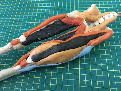
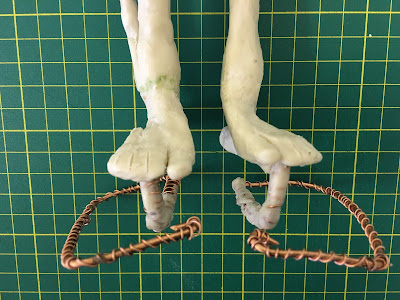
I have only just remembered that I completely forgot to post about my previous anatomy figure making class before we broke up for the Easter break as I just got so caught up at home I didn't even register that I hadn't written a blog post about it yet. I am not really going to be able to go over this is much detail as I can't remember all of the process that we used so this isn't going to be a very long post. Essentially this time around we were still focusing on the leg but have moved down from the thigh and started looking at the muscles found on the shin and how they effect the foot. Not only did we work using wax, we also had a go at shaping some metal wire too which has been added in order to represent the tendons of the foot so we can see how they connect. Ron went through each little section with us bit by bit so we knew how everything worked and what we were doing but we took our time with each piece as this was the fiddlest thing we have worked with by far. Getting the wire to stay in place was really irritatingly tricky but we got there in the end. As per usual I have just popped some visual examples below of the area we looked at and have also added my own photographs of my model which is coming along nicely.


Visual examples of the area we focused on in our previous class


Wednesday, 23 March 2016

Playing around with design ideas

Creating another character sketch page 


Now that I have had a proper think about the look of my candy based characters and have created, as well as researched into, a initial idea of what their clothing is going to look like I thought it would be a good idea to just keep the ball rolling and just get on with doing some more design work. The few weeks I have left before my deadline are very quickly beginning to slip away and I am incredibly concious of this and so I know I need to crack on if I want to get everything I have planned done on time. So as this was the plan I decided to get to work on something that I have been wanting to draw for a little while now but haven't been able to as my ideas weren't solid enough but now that I have an art style down, I have been able to work on a character sketch page. This is simply a step up from the last character page I did as this time instead of just faces, this page contains a few drawings of my chosen characters looking more expressive and actually performing a few actions as well as wearing a possible outfit designs.

As much as I made this is a page to show the progression of my design ideas, I also just wanted to draw all of my candy characters together as I am actually super passionate about these designs and I am really fond of them so drawing each of my characters one by one was a lot of fun for me. I wanted to create some work that just captured ALL of my characters personalities in one place before I have to pick and choose which designs I want to take further and I think that it has turned out quite well. This originally started off as just a regular page of outlines but I felt like I couldn't just leave it like this as I am trying to focus on both expression and colour in this project and so It didn't feel right to leave the canvas simply black and white so I decided to add some colour to my designs. I used each of my characters basic colour palettes which I created back in BA3A for reference on what colours I should be using, as well as actual photographs of what the sweets they are based on look like and I just went from there. Some of my characters stick very close to colour palettes I made and others I tweaked until I was satisfied with how they looked because some of the colour combinations just didn't work or didn't portray their chosen sweet well enough. I am actually really pleased with this page of sketches as I feel I have been able to capture how I wanted my characters to look pretty well and that I am now fairly confident to be able to move on and pick 2 or 3 characters that I want to design further.


All 7 of my original candy based characters


Saturday, 12 March 2016

Anatomy class update

Still modelling the lower part of the body 


I have just realised that I haven't done an anatomy work shop blog post in a while so I thought I'd better bring everything up to speed and just re cap on what I have been doing over the last few weeks. So essentially there have been three sessions since I last updated but we have only made a little bit of progress on the leg each week and haven't actually gotten that far ahead so there isn't a lot to write about. We have mainly been working on creating the thigh muscles, building them up bit by bit to make sure we know how each part works and we have also started focusing on a new part of the lower part of the body which was the foot.

This was nice to have a go at modelling because it was actually really simple to do and we went back to using the original white wax we had started with at the beginning. As the foot is made up of very very tiny intricate bones, obviously we weren't going to add this level of detail to the model otherwise it would be way too fiddly so we worked on building up the foot in bit chunks instead as it is a lot simpler to do and made sure our model was more structurally sound. We did however all had a look at the plastic models that Ron had bought in that show each foot bone in detail so that we knew what that area actually looked like for reference. Honestly this was the fiddliest bit we have worked on so far as trying to get the toes to stick and bend the right way was a bit of a challenge as the parts were so small but I think we all got there in the end. I have as per usual popped a few visual examples I found online of the area we were focusing on down below.


Visual examples of the areas of the body we are modelling 


I am actually pretty pleased with how my model is looking so far as with the little extra muscles and adding on the feet it is starting to come together a bit more. I am still really excited to keep working on it and building it up week by week as honestly these have been my favourite classes we have ever had at University. I think they have been really helpful for us to learn about the bodies shape and how the muscles work and I wish this is something that we had been taught right at the beginning of year one as I feel it was have benefited us more then but even so I am still really happy we are getting to do this. It is a great class. Below are a few up to date photos of what my model is looking like so far from a few different angles so you can see the front and the back.


Wednesday, 9 March 2016

Thinking about my characters clothing

Getting some style inspiration 


Now that i've spent some time figuring out what my chosen art style was going to be and drawing out some ideas of what my characters could look like I decided it was time to move onto the next step which is thinking about clothing. This is an area of the character design process I have honestly been a little stuck on, although have known pretty much from the start what I was aiming for with my characters appearance, what style of clothes they were going to be wearing changed every time I thought about it. All I have really been able to pin down is something colourful, cartoonish and a little over the top but with no particular style influences so far so I thought it would be a good idea to do some image research to see if I could solidify my ideas in anyway and come up with something that works well.

An similar example of what my characters clothes may look like would be the Japanese clothing style 'Harajuku' as it is usually bright, colourful, a little wacky and has a lot going. I have always loved this fashion trend as it is just so eye catching and different to the usually quite dull colour scheme and style that you usually see people wearing so I think this would work nicely as inspiration for my characters clothing. So essentially what I want to achieve is to create some clothing that is partially influenced by the creative style of Harajuku street fashions but with some candy looking elements incorporated to help portray each characters assigned sweet. Obviously I will also make sure whatever my characters are wearing will suit their personality so I wont, for example, have a character like Mintim who is smart and sensible wearing crazy clothing, he would wear something different like a waist coat and bow tie. I knew already of some different items of clothing that have been influenced by different types of candy as they were worn by the famous pop singer Katy Perry in her 'California dreams' tour. She had a look of different candy inspired outfits on her tour so I thought these would be good to look at for some visual inspiration and I have popped all the images I have looked at for clothing influence down below.


Doing a little design practice 


So after doing some image research into different clothing influences I was feeling really inspired to actually do a practice drawing of what one of my possible candy based outfits could look like. This would just be an initial design to get my ideas down instead of just floating about in my head and so I could see where to possibly develop it from there. I thought I was be a good idea for me to not design any clothing for any of the character I had thought up so far and to leave that until later when I do some more character development work and so for now I should just come up with a different design idea just to use as an example.  I though that the best type of candy to use for this visual example would be a lollipop as it is just so colourful and reminded me so much of some of the 'Harajuku' clothing styles I had looked at so I decided to use this sweet as my base and to try to draw an outfit based off of this sweet. So I have just popped down below a couple of images of lollipops that I used as influence for my initial clothing design so that I could focus on incorporating the right colours and shapes as well as my finished practice design. 


I tried to just have a little fun with this design and play around with the sort of look I am going for. I wanted it to be very colourful and not too realistic, so still keeping a cartoon like feel to it, as well as trying to incorporate a few candy based style flairs here and there to make sure the design was obviously based off of a lollipop. Honestly I could have played around with this for ages, just trying lots of different combinations but I didn't want to get too distracted as I knew I would be doing this sort of thing later on with my other official candy based characters and so I kept to just doing one simple outfit design. I think because the design was so colourful I didn't want to add too much detail to the actual outfit but overall It turned out pretty well and shows the sort of thing I aiming for clothing wise. So now that I have given this a test I can now move onto doing some more expressive character sketches and have a go at roughly drawing out some of their outfits and interactions. 


Monday, 7 March 2016

Beginning to draw all my candy characters

A sketch page of possible design ideas 


So after doing a little character practice piece just to help get the ball rolling and also so I could have a quick go at testing out the art style and colouring method I am planning to use for this project I decided that it was time for me to crack on and have a go at drawing all of the candy based characters I had planned out. Now this is just something I have been wanting to do for a while now because I have all these visions of what I want my characters to end up looking like at the moment and have, over the course of BA3a and BA3b, have been able to narrow down my ideas so that I know what kind of art style I am going for so I thought it would be a good idea for me to draw each of my characters in this chosen style just so I could get my initial ideas down visually before I start progressing with developing them any further. I have just popped the character sketch page I recently completed down below so you can see how my ideas are looking so far and have colour coded the sketches so you know who each character is.


Originally my first idea was to create a sketch page of my characters as full body drawings but I haven't actually decided on any clothing styles yet, which is what I need to do next really, so I thought just doing a page of head shots would be easier where I could have a little experiment with initial possible hairstyles and expressions for each of my characters. Doing this sketch page has really helped me visualise the type of look I am going for design wise and also allowed me to have a think about what my characters facial expressions would look like in order to portray the type of personality I want them to have which was a lot of fun to do. I am pretty pleased with how this page of designs came out as I think I have been able to capture my characters quite nicely so now what I need to do is move on from this point and just keep developing them further.