Friday, 31 October 2014

The design process

Concepts for Light


After completing my original rough sketches for my character Light, I started to get to work on a small character sheet that includes different elements I went through in my character design process. I started off by sketching out a new improved drawing of the original image I made using alchemy to make the design a lot crispier as I feel far more confident drawing on paper and also so I could try and add new elements to the design. 

Overall I have to say that this is my favourite design for light but I felt like it was important for me to explore other design options so I completed a few sketches below to show various examples of other possible designs that Light could have, these include the shape of the head and facial expressions.


Thinking about the art style for my game

First rough concept 

After having a clear idea for what my game was going to be and writing about each aspect in a good amount of detail, I decided it was time to move on to what the art style would be for game. I had a pretty clear idea in my head since I starting thinking up my game concept of what I wanted my style to be. I was fixed on it being in a Black and white colour scheme and for it to be a 2D side scroller as I knew it would fit well with my game idea and that other games that have gone with this theme have been successful which I included in my research mood boards for a bit of inspiration. These games were, 'Darklings', 'Limbo', and 'Contre Jour', which can be seen in the images below.


 Art style wise I could that 'Darklings' had fairly similar characters designs to what I had been thinking up so I knew it was important to try and avoid their style and try to make the characters I am designing not too similar. I had a clear idea in my head that I wanted to create 'cute' characters in a  soft and appealing cartoon art style to keep my game simple and give it a relaxed feeling to it.
I decided a good way for me to get a vaguely rough idea of what I wanted my main character, Light to look like, it would use the software 'Alchemy' which I actually used for BA2 to produce fluid and creative silhouettes and I really like how bizarre the programme was as it would create images that you wouldn't have been able to think of without it.

My aim was to create a design idea that I have had stuck in my head since I started coming up with my concept and try to see how it would look in a black and white style. The first image below is the finished rough concept for my character Light. I wanted the design to be very simplistic and not too complex so that it would work well in a 2D side scrolling game using and to use white as the main block colour to help represent the glowing entity. Below this design is a example of one of the small orbs that would be found in the game which I tried to give a similar feel to as I did with light.

These are obviously very early concepts at the moment but now that I have a idea of what I want to do I will be able to draw out some more sketches of my design ideas and begin to build up my game level piece by piece. 


Thursday, 30 October 2014

Learning about signifiers

What are the signs in my own game?

During our most recent contextual studies class, we re learnt about the importance and different uses for 'signifier' with in games which was taught to us in our previous session but as I wasn't able to make it to that class this was a completely new concept to me.

I learnt that a 'signifier' is basically a sign of sorts. Something that makes itself present to the player and catches their attention, notifying them that they have either completed a action or still need to. So for example, imagine a big green button which is giving out a steady glowing light. This appearance of the button in a game environment would signify that it needs to be pressed as it is capturing the players attention with its bright glow and noticeable presence.  Then, let's imagine that the button has been pressed, all light drains from it and it remains a dismal and bleak green colour, this appearance would signify that the action is complete and the button is no longer in use.

Having learnt about signifiers in games, I thought it would be important for me to list my own games signifiers and explain how the character can interact with the object.


The different orbs of light 

Throughout my games levels their will be different types of orbs scattered around in the darkness which light must collect in order to restore daylight to the level once completed.

Small orbs:  Small orbs act as point system so in order to get a 100% pass of the level when you finish it, you must make sure to collect all of these small orbs.

Cluster orbs:  cluster orbs act as a check point so, if light was to faint from being 'hit' to many times, you will be directed back to the nearest cluster orb you collected. And, when you do interact with a cluster orb, it releases a large flash of light that completely re lights the level for around 10 seconds, before fading back into black. This will allow the player to briefly have a rest period and plan out where they have to go next.

Large orbs:  The character light, is only giving off a small warm glow throughout the game that gives you a limited view of the level but this can be affected by picking up a large orb. Large orbs act as a big boost of power, which light can use to increase the amount of glow they produce, increasing the lit area that the player is able to see but this will only last around 10 seconds and then it will eventually fade, leaving you with what you started off with.


'Shadows' (Dark's henchmen):  Throughout the level their will be hidden enemies lurking in the darkness. These are henchmen that have been sent out by dark to try and steal all the remaining orbs of light left behind which they do by eating them. They will be completely invisible to the player until the orbs they have eaten begin to glow in their stomachs.  It is then the players job to locate and fight the darks henchman to release and collect the orb.

Forest creatures: As your main goal as Light is to collect the orbs and make your way through the level, there will also be a secondary mission, which is to find and save the lost creature from the darkness and they will be hidden somewhere in the level.

Harmful objects: Throughout the level their will be certain objects that Light has to steer clear from. These will be different types of plants and foliage for the early levels as I want the environment to be set in a mystical forest.


Wednesday, 22 October 2014

Thinking more about my concept

The feel

After our recent session where we all presented our game idea to the rest of the class it allowed me to think more about my idea and how I could possibly develop it further. I started off about thinking about what the feel of my game is. What sort of feeling is it giving to the player? Is it creating a emotional response? These are really important aspects of creating a successful game and something that we have to focus on in our project.

After giving it a little thought I realised that my game is representing a couple of core feelings, apprehension and hope.


Apprehension 

The darkness within the game represents the unknown, a black area that could hold a multitude of possibilities. The fear of the unknown is very common and is often the reason why people are scared of the dark, it causes you to become apprehensive, thinking that there maybe something lurking in the shadows. This is what the darkness in my game represents, the feeling of not knowing what is going to happen next but this feeling could spark curiosity in the player and a urge to explore the darkness to see what secrets it may hold.

 Before hand I was simply going to have two interactive objects in the levels, Dark's henchman that are hidden in the darkness until the orbs they have eaten in their stomachs occasionally give out light and the untouched orbs the player must collect which give out a constant glow but now I want to add a third object, a object that is completely hidden in the darkness and won't be seen until the player stumbles upon them. I would like this to be a creature. A creature that is lost in the dark and it will be be a side goal for light to find all of these creature, saving them from the unknown. This interaction will also represent the feeling of loneliness which will hopefully engage the player, making them want to save all of these lost creatures due to the fact that everyone has felt loneliness and knows how painful it can be.


Hope

The character light is another aspect of the game that creates a emotion, they are not only the representation of light, but hope too. The feeling of being surrounded by situations or events that may make you feel uncomfortable, stressed, upset, lonely or depressed which regularly causes the emotional response to hang on something that may help you escape. This is the feeling of hope and that is exactly what light is, a slither of hope. They are defeating the darkness level by level bringing balance and clarity back to the world.

Lights overall goal is to safe dark from their spiral or anger and rage, to comfort them and try and come to a alternatum. They manages to persuade dark to calm down and introduced a new deal to them, that they will be allowed to be out more at winter which will allow more people to accept the dark and be more comfortable with it although to keep the balance, light must be allowed to have more time in the summer.
This whole concept of light bringing dark back to their senses is a representation of a helping hand, someone who is their to comfort you, help you, trying to make you comfortable when you feel at your worst and giving you that little bit of hope to keep you going. Essentially the game could be touching on the feeling of depression and the idea of someone being their to fight your fears and bring balance back to your world.


Overall I think my game has quiet a few deep emotions running through it which will help to enlisted a good feel for my game and gauge an emotional response from the player.


Presenting our concept to the class

Thinking about my game idea so far

For our third Monday session we were focusing on developing our game concept. We were asked to spend around a hour and a half creating a small power point presentation with information and images relating to our idea on each slide before we gave a small 2 minute talk to the class about our concept and then receive positive and negative feedback. 

This was a helpful exercise as it allowed us to really think about and focus on all the key parts of our concept, the mechanics and making sure the the story line made sense. I quickly made two slides which can be seen below. I tried to add in all the important pieces of information about my game that we told to think about in the design process and information about the story line and game play so that people would be able to clearly understand my idea and, with the visual aids I added, try to visualise the design in their head. 

One piece of my game concept that did change is the platform it would be played on. Originally I had hoped for it to be used on a android phone or tablet but I believe that the touch system would have to be too difficult to use for this sort of game so I changed my market to the PC and Nintendo DS as they are far better suited to the game play I will be using. 

When it came to feedback I was pretty disappointed as I was hoping for some really critical suggestions so that I would be able to build on my game a little more but unfortunately this didn't happen and all I got was pretty much silence and smiles. One of classmates did ask about what the two characters were going to look like and I gave him a vague idea but it will probably be best for me to start working on character concepts to help get a better feel of the style of my game. 


Roughly creating a 2D side scrolling level

Session 2

For our second session in unity we were introduced to the new and improved 2D side scrolling game that our tutor George had developed and created in Unity. It was similar to the level we looked at in our last session but he had tweaked it's coding and structure a little so it had become a fully working game environment.

We were then told that we must rearrange to level to create our own version of the game, creating a new layout and different placement of all the little objects scattered throughout the level. When we were satisfied with it would had to get other members of the class to play our game, give critical feedback and then we had to edit it. Unfortunately no one in the class really got to that stage as we all got a little wrapped up in editing the level as, I have to say, it was a lot of fun.


Above is a 2D and 3D view of what my edited game ended up looking like after the session ended. I began with moving all of the long rectangular blocks around that were the border and platforms in the level to build up my own pathway for the sprite to move around. I wanted to keep it fairly simple but, also add in a few difficult parts for the player here and there so that it was too easy, this was achieved by adding in jumps that the character could only just make, and a large amount of the deadly spikes that, when the sprite touches, causes the character to immediately lose all their health. I also scattered a few point boxes around the game to guide the player through the level to reach the overall goal.

One the rough layout was completed I was then able to start changing the design from the neutral grey colour it was before. I knew that the chosen sprite was supposed to be a miner due to the light on his helmet so I went off of this and build in a plane that I moved behind the scene, using 3D mode, and added a seamless rock texture on top to give the effect that the character was underground. I then went about changing the colour of the rectangles to a muddy brown to help give a clear border and to block out the level and show the player knew which way to go. I made sure to darken the background and change the intensity on certain objects that the player had to look out for, such as the point blocks, time blocks and spikes. This was so the player could see them clearly when progressing through the level. I did want to do a few creating lighting effects to make it seem like the character was travelling by torch light but I did have a little trouble with this and ran out of time before I could do anything. 


Overall I thought this was a interesting exercise and I found being able to mess around with a pre made level to be a lot of fun but the only reason it works so well is because all the coding was done for us which was a bit of a pain as I really wanted to know how to make different objects do knew things but as we haven't been taught any coding yet I didn't know how to do this. Coding is a crucial part of the game creation process so I really hope that we learn about it soon as I am eager to to know how to use it properly so I could possibly start making my own games at home.


Monday, 20 October 2014

Looking at a 2D side scroller

After looking at a 3D stylised game to explore possible game play options, I decided to look at a 2D side scroller game, which is the type of platform I want to use for my concept. I had already looked a couple for image research which was all well and good but I didn't want to re use any research so I asked around for suggestions for a side scrolling game which had a similar feel to my own concept.
One of my friends suggested 'Pid' which was a game I had never heard of before, so I began to do a little research, mainly by watching walk throughs on YouTube and scrolling through Wikipedia.


PID

Pid is a 2D side scrolling puzzle based video game which developed by 'Might and Delight' and released in October 2012. It is a console 'extra' game so it could be played on the Xbox 360 via the Xbox live arcade and on the PlayStation 3 through the PSN.

You play as a young boy called Kurt who has, for some unknown reason, been left stranded on a remote and strange alien planet. He decides to explore the curious land he is living on but ends up meeting and befriending inhabitants of the planet who help to try and return to boy to his home as well as running into large amounts of threatening robots who have other more violent intentions. Your goal is to uncover mysterious of the alien planet and return safely to your home.


Gameplay wise the player must utilise a large amount of different game play styles and mechanics to be able to solve the puzzles that lay ahead of them. For example, Kurt posses a type of tool that allows him to create a white beam of light which creates a anti gravity of sorts which he can use to propel himself and move Kurt in certain ways that can be used to solve many the puzzles, this is a fairly similar concept which is found in the game 'Portal'. This methods is a key was that Kurt is able to interact with the game environment but it isn't the only option. as you travel through the game you stumble across new tool's for him to use to help him survive in the alien terrain. One example is of a pair of blue and red coloured bombs which can be used to hurt enemies but only if the time of your throw is right as this game is all about strategy, timing and solving problems.

There is also a multiplayer option which allows you to play co-op with your friends, enabling you both to be able to try and solve puzzles and defeat the robot enemies as well as working against each other to test each players skills.


Funnily enough this game was created using the software we have been learning how to use these last few weeks, 'unity' which is fantastic as it allowed me to see level of games 2D games could be produced using this program. From watching the video further up in the post which was a trailer of 'Pid's gameplay, mainly focusing on the first level which was set in the cave, I could see a slightly similar mechanic which I knew I was aiming for to make my concept work. This was the design of a dark background with a small dim area of light which is exactly what I would need to do to make my game work so it was nice to see that this effect could be achieved using unity.

Having a look at this game allowed me to see what Unity was capable of when it came to 2D side scrollers even thought I am aware that this was created by experienced and talented game designers and animator but it still gave me a large amount of confidence for creating my prototype. The next stage for me is to start writing pretty much everything about my concept, going into detail about each aspect to make sure I have a strong and doable concept to work on.


Thursday, 16 October 2014

A quick look at a stylised 3D game

Even though when I was coming up with my concept I had pretty much decided that I am doing a 2D side scroller and to be fair, after learning a little about unity, I am fairly certain I am going to be sticking with this style I still wanted to have a little look in simple 3D games just to have the option there in case I need it.


ANIMAL CROSSING

The game I decided to look at is one that I have gotten very addicted to recently and it is called 'Animal Crossing. New leaf'. It is the second animal crossing game to be produced by Nintendo due to the first games mass popularity. It is colourful and warm community simulation video game which has a very simple story and game play which manages to make the game fun and easy to get hooked on.


Originally in the first Animal Crossing game you had a fairly simple story line, you were a citizen who moved into a new town and had to do simple tasks such as collecting items around the town to be able to sell onto a shop keeper in order to get enough money to pay off your loan for your house, buying accessories to customise your character or helping citizens with simple tasks.

In the Anime Crossing New leaf game it is a very similar concept and your complete exactly the same tasks, except a new story line as been introduced for the newer game. You start as either a boy or a girl (player's choice) who is moving into a town they have never visited before but as soon as you arrive, you are mistaken for the town's new mayor who, coincidently, happens to be moving to the town too but never actually shows up. The citizens, who happen to be colourful and friendly talking animals, immediately adopt you into there community with open arms, expecting great things from you. From that point on you are responsible for certain aspect of the town, keeping the citizens happy and working on public projects and as your success increases, your town will grow. More shops will be added and new citizens will move in.

Animal Crossing New leaf has a large array of activities for the player to take part in, for example you can collect bugs, fish and fossils and either keep them or sell them onto the local museum. You can even decorate your house with them, or buy new furniture from the furnishing store to personal your characters living space. Or you can go for a leisurely walk around your town, picking fruit from the trees as you go or visit the small beach to find shells. There is also the brand new additional feature added to this game, where you can visit the tropical island to discover all new types of items that aren't found in your town.


Animal Crossing is a 3D game that was produced only for Nintendo consoles such as the Nintendo DS, Nintendo Wii and Nintendo Game cube. It has a anime inspired look and feel to it, with simplistic 3D models and colourful environments for the player to explore. The fact that the game is done in 3D dimensions and also had a 3D view means that the game is trying to draw in and incorporate the player as much as possible which is a really nice element that having 3D dimension can add.

I feel like if I did decided to go down a 3D route for my game then this sort of style would definitely be a big influence on it although I think the concept of my game may get even more tricky to play with a third dimension thrown in.


Learning the very basics of Unity

Session 1

We had the first workshop of the new term previously and this session was focusing on the programme we would be using the create our game's prototype. I was software I had never heard of before called 'Unity' which is used to import game asset into a engine to be able to create a developed and working game, similar to that of UDK. Unity is also capable of not only creating 3D games, but 2D ones too so it would be perfect for making a side scroller platform game.


When you open unity up, it looks like the image below. It's interface is actually pretty simple and clean looking compared to other pieces of software I have had to use through out my course which just has loads of tabs and writing scattered everywhere but even so I made sure that I made my self step by step instructions on everything George told us otherwise I knew I wouldn't have a clue what I was doing. 


Once we had a good look round at all of the opinions Unity had to offer we were then taught how to complete and create very simple modelling tasks that would help up understand the basics. Thankfully I found that Unity is very similar to Maya but a hell of a lot easier to work with as I was able to pick up how to do things a lot quicker. We were taught firstly how to create objects such as the sphere, plane and box seen in the picture above which is what we need to know to be able to start blocking out our prototype level.


After we created our basic models and placed them in the level, we then learnt how to add in other elements that would help build up our game. At the moment we were focusing on a 3D based game so we had to learn how to create the different ways that a 3D game could be played, for example first person or third person perspective. In the first image you can see that cylindrical looking shape on the right, this is the first person camera that we were taught how to add so, when I change the view port to game mode, I am able to use this camera to run around the my level in a first person view which is the second image out of the two above.

We were also taught how to import a pre made 3D game character that has already been completely animated with run, walk and jump cycles so we would be able to see how a third person view could be achieved if this was the sort of concept we were going with.


The next element we focused on was how to add textures into our environment which isn't necessarily essential for the prototype but it was important to know how to do anyway. The process is fairly simple to be honest and I was able to put some textures I found from Google on the objects which would obviously look for more effective if they were properly UV mapped but luckily as we are only prototyping we won't have to do that aspect of modelling.


Once we had looked at the very basics of making a simple 3D game using Unity, we then moved onto how a 2D level could be created. So basically I kept the 3D models I had had made in the level and then, when I pressed the 2D bottom at the top of the screen it changes my view port in a side scrolling looking level as you can see in the images above. So basically the idea is that you make flat shapes and then lay out in to build up your level if you want it to stay two dimensional but, if you model 3D shapes, you can have both a mixture of 2D and 3D so for example you could have a sprite running around a three dimensional level if you wanted.

Above is a very rough example of a the two dimensional level I made in class as we were being taught, unfortunately I am a little rubbish at Photoshop so I wasn't sure how to get rid of the white in the background so that is something I will have to work on.


After having this tutorial I am more than certain that I want to work on creating a 2D level. I found the creation process fairly easy to work with and I believe that two dimensional designs are really going to suit my concept well. Now I need to start researching into Unity tutorials and demo videos for extra research to make sure that my prototype is as good as it can be.


Wednesday, 15 October 2014

Research into memory based games

What I found 

Since I have decided to go with Idea 1, I thought it would be important to look in different games that have a memory based concept or theme. I soon realised that this wasn't as easy as I thought as once I started researching, I realised that there wasn't a lot of information or results for games with this sort of theme. I did manage to scrape together a few examples but, to be fair, they aren't brilliant.

The first thing I stumbled across was a rather cheap looking flash game called 'Memory Mess' which a very simplistic layout and game play although you do have three levels of difficulty but as I am not so brilliant at these sort of games, I stuck to the basic level.
You start off with a Grid filled with different images (as seen below) and it is your job to memorise were all the coloured grids are in under 15 seconds so, for example, if you look at the image below, you will me trying to remember were all the yellow warning signs are. After the time has run out, all the little squares in the grid flip over to face the other way so you can no longer see the icons and then it is your job as the player to select which squares had the warning signs on them.

THE GAME: http://www.mindjolt.com/memory-mess.html


Once looking at the rules of the game, I realised that I had seen this concept and even played games just like this before. I then delved a little deeper and found this this sort of game is normally played with cards with images printed on them, a little bit like 'Snap'. This game has been around for a long time as is fairly well known and popular due to the fact that it can be played by people of all ages but before modern games became influenced by this game play, there were a few earlier games with the same premise to.

The one I found was a very early board game called 'Concentration' (as seen below). The rules are that you used the cards provided, a stack of 52 and you lay them face down in four rows made up of 13 cards each. The, in turn, each player picks two cards and then turns them face up so they can see which cards they are. If the cards happen to be the same rank and colour, (eg the queen of clubs and the queen of spades)  then the player wins the pair and plays again. If they aren't the same then they are turned face down again and added back into the grid. It is then your job to try and remember which cards have gone, or where the unpaired cards have been put pack. The game will finish when the last pair has been picked up and the winner is the one with the most pairs.
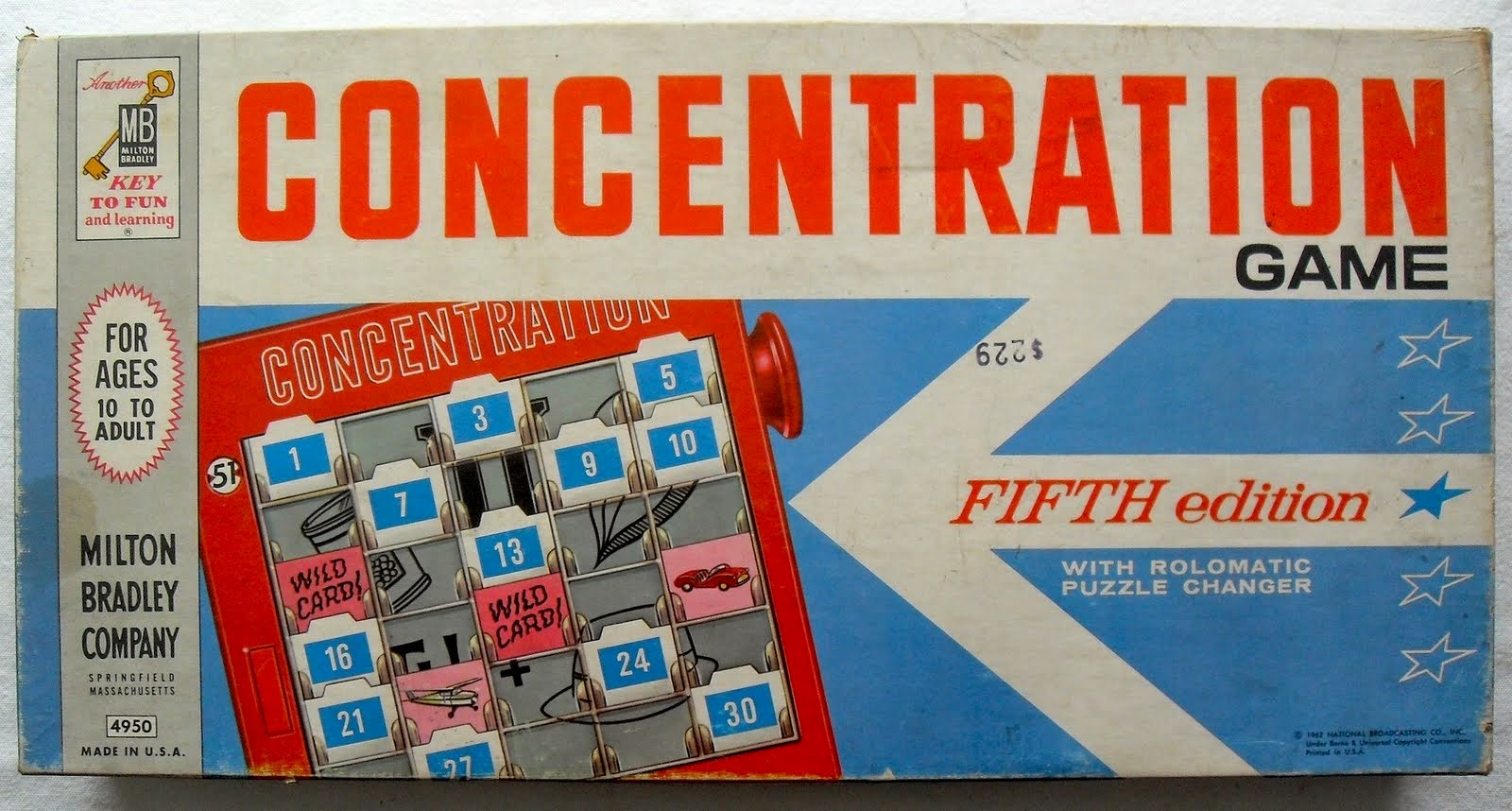
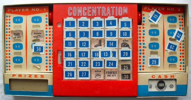


Due to me research coming up a little short and only being able to find memory based games with this type of concept, I decided asked my peers if they could think of any other type of games that focused on using your memory. One of friends suggested a board game which I had never heard of before so I researched a little into it. The idea suggested was the 1978 electronic game called 'Simon' (seen below) which is actually based of off the spoken game 'Simon says', it's slogan being "Simon's a computer, Simon has a brain, you either do what Simon says or else go down the drain." 

Basically this game is very simple, as the round begins, the device with play a sequence to you so for example, the red panel with flash, then blue, then green. It will then be your job as the player to repeat the sequence identically, making sure you hit the coloured buttons in the right order. The sequences you have to remember with get along longer, thus harder, as the game progresses.


This is yet another memory game based concept that I have heard of before which means both of these concepts have lasted the test of time due to their popularity and mass appeal. But what I did find very interesting is that I didn't find a single thing on a memory based side scroller, so my game could be a idea that is fresh to the games market which I think is really exciting and has given me even more hope for it's progress.


My final choice for a game concept

I am going with Idea 1

I had a long think about which game concept I really wanted to work on and I felt most passionate about Idea 1, the memory based game about dark and light, so this is what I will continue working on and try to delve deeper into.
The plan is now for me to start researching into many different areas such as other games that are memory based, 2D side scrollers, certain game styles. This will hopefully allow my idea to expand and explode into many different variations until it is whittled down to just one.

This will also include me trying to choose a name for my game. I did really like the name LUMOS but it is the name of a spell in 'Harry Potter' series so I will have a think about that one, I have also chosen two other names, GLOW and DIM but I don't think they are as strong.


Monday, 13 October 2014

Lecture on the use of colour in games

Why is it important?

On the 13th we were given a lecture by one of our tutors about why choosing specific colours for certain concepts in your game are so important. Usually I am fairly confident with choosing certain shades and colours for a piece but this talk really made me re evaluate my colour choices as each colour holds a 'mood'.

Colour can change everything about an object, it's mood and how it is perceived. For example if you had decided to design a villain for your game you would need to choose colours that compliment their personality, so for example pink and yellow wouldn't be sensible options as in the media they both represent feelings such as warmth, happiness and brightness which doesn't particularly fit with villainous theme.

Below is a image I found when researching into the meaning of different colour's which lists short descriptions of what each colour represents. These are very important to keep in mind when in the design process as they can completely change the feel of the game you are trying to create. I have also an additional image of colour wheel which I will be able to use for reference later in the design process.


Thursday, 9 October 2014

Mood boards full of inspiration

Along with writing down the basis of my two concepts I decided to start collecting a large amount of imagery for inspiration as I had a lot of visual ideas in my head that I wanted to get down and the simplest thing for me to do was just make lots of mood boards full of pictures to help visualise my ideas. that may influence my design concepts.

~

IDEA 1
MAIN IDEA


I had a very clear idea in my head of what I wanted my game to look like so for the first mood board I decided to look into different games that used a black and white colour scheme and had simplistic game play. The ones I found were 'Darklings', 'The Invisible Swan', 'Limbo' and 'Contre jour'. Style wise, Darklings is probably the closet to the design concept I was thinking of so it will be important for my to play this game, review it a little and try to make sure my designs aren't to similar to this games. 


After looking at certain games that have stuck with a 'black and white' theme, I then starting researching and finding imagery of lighting that uses a similar theme as I wanted to focus on certain types of light that I could use throughout my game to capture a certain feel and mood. One of the main things I looked into was dim lighting in a dark room and this was to help me picture how the shadowing would work with this sort of effect as my game is based around the player only being able to see a small part of the map due to the light being given off my the character. I also made sure to look into more vibrant 'lights' as well, such as neon as added a more colourful element could completely change the feel of the game.


The next part of the process for me was trying to picture what the two main characters of my game, 'Dark' and 'Light', were going to look like, I had no clue whether I wanted a human looking character or something a little different like the Darklings's character (seen on the right) so I just collected a bunch of imagery of characters I knew that had a dark or light quality to try and find inspiration. At the moment I am leaning towards designing a creature instead of a human looking character but to be fair I am still a little in the dark about designs at the moment. (pun not intended) 


I had a rough idea in my mind of what sort of style and environment I wanted by game to be set in so I compiled yet another mood board with images that I could use for inspiration. I really liked the idea of my game being set in a fantasy forest which with give the game more of a mystical feel which is what I am aiming for. One of the main forest's I looked at was from James Cameron's 'Avatar' as is depicted a beautiful jungle environment that was set on a different planet so it has many different and bizarre species of plant which are visually stunning.  Other images I collected were mostly digital painting based on imagination. 


~

IDEA 2


For my second idea I had a pretty clear idea of what design I wanted to focus on so I did some research into 3D and 2D side scrollers with a certain style I was looking for. I looked at the games 'Below', 'Child of light', 'Lost winds' and 'Transistor'. Game layout wise I think Transistor is the closet to what I had in mind, a over head view with 3D elements thrown in instead of going with a typical 2D side scroller but style wise, I am looking more towards lost winds for inspiration, especially with the under ground levels.


When I was thinking about and writing up the story for my second idea I had a very clear image of my head of what kind of female character I wanted to be as my main protagonist as I already knew of three pre existing characters that had a similar feel to them and that I had taken inspiration from. 
The characters are Ellie from the game 'The Last of us', April O'Neil from the 2012 series 'Teenage Mutant ninja turtles' and Clementine from the series of games called 'The walking dead'. These girls all have very similar qualities to them, a rational fear of the creatures they go up against at the beginning but during the course of the game/series, become stronger and far more mature.


When thinking up the game concept, I knew I wanted it to be set in a old mine and I did have a clear idea in my head of what this looks like but I thought it was important to make a collection of images anyway that I can use from references later on in the creative process. I also did a similar thing with the industrial futuristic city I had in mind for the setting of the game. After this I did a little image research into games that have used mine's in them and I found quite a mixture of different style which will definitely help me for inspiration later on.


My first thoughts for game concepts

After completing our session were we came up with quick 10 minute game concepts, we were told it was time to branch out and try and come up with a few other ideas for our own video game. I immediately started jotting down a couple of ideas I had been thinking up because I wanted to get down my basic idea before I found any image research which could initially change my concept.

The first idea is the main concept I want to run with but I have also written up my other game concepts below too in-case I have to revert to them,

IDEA 1 - MAIN IDEA
  • 2D Side scroller 
  • played on a smart phone or tablet 
  • memory based game 
  • fantasy theme

Story: The concept of my game is based around light and darkness which are elements that nearly everybody has experienced. The story behind the game is that light and darkness have physical representations and darkness as become extremely jealous of light due to the fact that more people favour the day over the night. For the world to keep balanced light and dark have always worked together in harmony but over time dark become bitter and decides they have had enough, using all of their power to throw the world out of kilter, shutting out day for the world, casing light to become weak and helpless. As the player, it is then your role to play as the struggling light in order to bring balance to the world.  

Game play: The character light, who used to be powerful and full of life has now be reduced to a small, dimly glowing creature, who only is only able to produce light in small bursts.
So at the beginning of the level light will automatically produce a burst of light, allowing the whole level to be seen which the player must try and remember because after about 5 seconds the map darkens again. It is then your job as the player to work your way through the level based on what you can remember, only being able to use a very small amount of light that is glowing from your character,

The first few sets of levels will be very simple and basic maps with possibly a longer time limit for people to be able to remember the layout of the level but as the levels progress they will become far more difficult to progress through. Throughout the level there will be different objects that you encounter for example, one of these will be small orbs of light that act as check points and, when collected, will allow another long burst of light so the player is allowed to see the next stage of the level. Also scattered round the level will be dark's henchman who have been stealing and consuming the orbs of light from the world. They completely invisible to the player and can move around the level at will but you will be able to tell on occasion where about they are as the  orbs they have eaten will glow in their stomachs, revealing their location.

~


IDEA 2 

    • 3D side scroller 
    • available on Nintendo DS or PlayStation Portable  
    • futuristic theme

My second idea is a little less developed in comparison to my first one but it is a concept all the same.

Story: The earth has become a industrial and electricity based mess, rural areas slowly being sucked up into the growth. Due to this, the over powered cities waste is increasing dramatically, causing it to sink deep into the soil beneath it, slowly corrupting the earth.

In the heart of the city, a 18 year old girl is running away from home due to her having a large argument with her family. She decides that the only place she can go is the old family home that resides miles away in a rural space. Whilst travelling there a large storm hits so she decides to find shelter in one of the old mine's that were used to dig for precious elements that gave the world a sudden boost in wealth. Due to exhaustion she loses her footing and tumbles down a unstable mine shaft, leaving her stranded and alone.

Game play:  From this point on the player takes control, controlling the girl to try and help her escape the maze of mine shaft's tunnels so she can reach the surface, surviving off of the items she packed in her backpack. Little does the girl know that due to the toxins dripping into the soil, the whole mine has been infected, accidentally creating creatures that now roam the darkened tunnels which must be destroyed before they reach the surface.

Due to the girl coming from a very technical based world, she knows a few engineering and electrics skills that come in handy when creating weapons to use against the creatures.


Wednesday, 8 October 2014

Creating game concepts exercise

So in our first group taught class this term we were given a creative game to play which was created to enabled us to come up with different and 'unique' game ideas. Basically each person in the class was given a card with a phrase/title on it and from using what was written, we had to plan out a rough concept for a game in 10 minute time frame.


CARD 1: Giraffe clone parade 

My game idea: In this 2D game the player takes on the role of a local zoo keeper who has decided to enrol his heard of giraffes in a local parade to entertain the public but it's not as simple as that, as the giraffe's you look after are unruly and troublesome. It is your goal as the player to keep your animal's in check and preforming properly.

So, for example, one of your giraffes may wander away from the rest of the group as he is more interested in snacking on the leafs in a tree nearby, it is then your job to lure the animal back to the parade. You can do this by picking up objects dropped by the crowd or using complete on screen tap sequences. You score increased via the happiness of the crowd, if one of your giraffes leaves the group, your score will immediately go down so your goal is to complete the level with a certain amount of happiness points otherwise you cannot progress to the next round. You would be able to play this game on a mobile device or tablet, using a system of tapping and dragging on the screen.

Who is the game aimed at?: The product has a very wide age range, 6+, due to the fact that it is a game that could be played by anyone.  

~

CARD 2: birth of a new day

my game idea: The game concept I had in mind was a very simple tap and interact system that is represented in almost a story book style. Basically my idea is a game that teaches young children about their daily routine and how important it is for a healthy life style. It would be in a style similar to animal crossing where the player has a customisable character that they can make move around the screen and interact with objects so, for example, the player will be given a set of instructions that they have to follow and complete in order. So, let's say the character need's to brush their teeth and the player touches the toothbrush in game, they will get a reward and a little window of text telling them why brushing their teeth is important for their health and a key part of their daily routine.

This game could be bought as a app game or used in school to help educate children and introduce them to technology at an early age.

Who is the game aimed at?: The game is aimed at young children but would also have to be marketed certainly to appeal to parent's too because in they end they are the one's buying it.


I thought this was a really fun and creative exercise for creating a game concept and having a short time limit forced you to rack your brain for ideas you may not have even thought of before hand.

Introduction to BA4

Overview and opinions of the first project 

On my return back to university in my first class of the new year my group and I were immediately introduced to the new project. I had a vague idea of what work we were going to be expected to produce due to skim reading through the brief on the VLE, but this short lecture gave as a very brief insight into what the new project would be.

Originally the project was planned to be a group exercise which I was a tad apprehensive about as I know how most group projects usually pan out but it decided that his part of the project was removed and it would remain as a solo piece of work which I felt a little more comfortable with.
Overall it was explained to us that our project would be to create a GDB (Games design brief) of a game concept of our choice, then create a rough prototype of the game and finally give a 10 minute presentation about your design. I immediately came to the conclusion that this is A LOT of work to get done in a 8 week period and that I would have to push myself more than I did last year as well as working at a fast pace to get everything finished before deadline.


I have never seen or worked on a GDB before, all I really know is that is a detailed piece of documentation that contains the complete structure and concept of a game in production aka a story, characters, designs, props, ect. Learning how to create this detailed plan will be a brand new challenge for me to get to grips with and it is crucial that I do. When it comes to the prototype I need to remember that it doesn't have to be a full and complete piece, just a rough but understand piece that people can navigate around to help sell the game. I could experiment with blocking things out in 3D or maybe even have a go at flash player if I decided to stick to more of a 2D style.
As for the presentation, I feel far more comfortable with the thought of discussing my idea's for a large amount of time due to the previous project we worked on which also included presenting my ideas and concepts to he tutors.

 So overall I AM feeling very nervous about the amount of work I have to produce in such a short space of time but I am also looking forward to trying to push myself and improve from last year.

Tuesday, 7 October 2014

The beginning of a new term

Pieces I have been working on over the summer break

Well it is the beginning of a new academic year for me which I am both apprehensive and excited about getting into as it feels like such a long time since I have been university and seeing as I know as soon as I return I am going to have ALOT of work to get done, I thought it would be a good idea to upload a few pieces that I completed over the break.

Initially I began working on a piece that I have been meaning to colour for a while now which is the first image I uploaded. I wanted to create a piece that was a little different from my regular one's which is normally just a close up of a characters face so this time I tried to focus on adding a 'prop' for my character to interact with, in this case it happens to be a rabbit.


 ~

One huge influence for me over the summer break occurred when I went to go see Marvel's Guardians of the galaxy. It instantly fell in love with this film and it quickly became my latest obsession, so after this mind blow a lot of my drawings began to spiral off from the film. It began with a little bit of fan art of the deadly assassin Gamora which I found a lot of fun to draw due to her unusual skin tone and marking on her face and as soon as I was finished with this piece I knew exactly what I wanted to draw next. I wanted to create a character that could easily blend into the Guardians of the galaxy environment and cast because why not, so I began sketching out my ideas for this person.


~

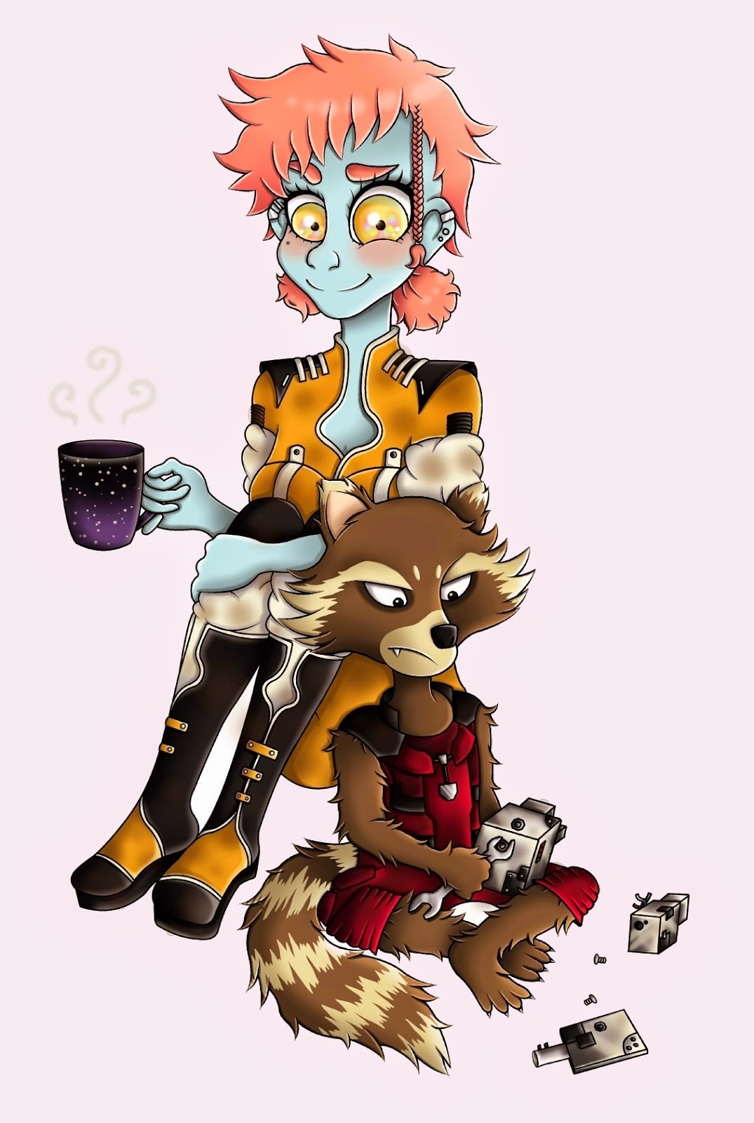
Below are a few pieces I created of the sci-fi influenced character who I named Tali. After creating a initial first piece portrait so I could get the feel of the colours I wanted to use for her I then began roughly sketching out concept of what her energy guns and yellow jumpsuit would look like which I really enjoyed doing as I felt keen to bring this character to life. When I felt comfortable and confident enough with her design I did a very rough 'chibi' sketch of her to, once again, make sure all the colours worked well together as a piece and then I finally moved onto my big piece.

I decided it was about time that I did a full body piece with a few different poses incorporated because admittedly I do normally shy away from drawing that sort of thing as I don't feel practically confident about my anatomy drawing but I knew to be able to improve I would have to give it a go eventually. I used a site called pose maniacs for the anatomy references and then I had to make sure that the proportions and sizing between the two characters was correct which took a little re editing and cropping but it got there eventually and to be honest I am actually very proud of this piece.