Monday, 31 March 2014

Personal Drawing

A quick character design

After completing a chunk of my work I decided that I wanted to take a break from my project for a bit as it was starting to stress me out a little so, as I was experiencing a 'good drawing day' I decided to do a character design sketch. I had inspiration to draw a character after watching the Walt Disney production 'Treasure Planet'. This is a movie I used to watch non stop when I was younger and by re-watching it now I can see why I liked it so much. The concepts and designs in this film are visually stunning and creative, plus it has a style that I am very fond of. This style is when there is a mixture of fantasy and Sci-Fi, where older objects have been rebooted with newer parts. The film is mainly based around space pirates which is what really gave me idea for my character design.

At the moment this is what I have design wise. I like starting with the face and hair as it always really helps me get a grasp and develop what the character is going to be like. So far this is what I have sketched out but I also have ideas for what the rest of her outfit and weapons will look like which hopefully I will get around to drawing at some point but I am more likely to draw out a page of expressions first as I enjoy drawing them.


Castle Concept

Sketching out my idea

So after pooling my ideas and collecting my specific image research I had a go at starting to sketch out my idea as I really wanted to get some designs down in rough before I leaped into the modelling stage. The first image is of an early beginning sketch I did, I really wasn't too keen on this design and it was pointed out by one of my fellow students that it looked more like a city than a castle which I had to agree with so I decided to go back to the beginning, using elements of this design and adding them into a new one.

The next image was me just quickly getting down a layout of the castle, trying to work out how all the buildings would be placed and how the proportions would work. As you can see I actually changed the layout a lot as I kept drawing it too big or there were design aspects I added that I knew wouldn't work so I had to get it down to the basics before I could move on. With the final layout in mind I started thinking about what the castle itself would actually look like. I then started sketching some ideas of building designs which are drawinga in the last image.


Saturday, 29 March 2014

Coming up with a concept

My design ideas

As I have completed a large chunk of my research I decided to move onto concepting my castle. This is a key part of the 3D process as if I don't have a concept or rough idea in my head I am going to be in a bit of trouble. I have had a few days now where I have been struggling to come up design that would suit the theme I have chosen, this is mainly because I am feeling a little stressed by the amount of work I have to get done before the deadline. I am very new to doing any 3D work and I have no experience with games engines and know little about them, so this project is already a bit of a challenge for me. I have also chosen a theme that I don't believe anyone else is doing so I have a lot more work to get done and I am already starting to feel the pressure a bit.

To try and get my creative ideas following I decided to have a look back through all the mood boards I had created, picking out different images that are related to any design ideas I have had. Below I have added all the pictures I have chosen to work from and have written why.


Image 1: This first image is of Theed Palace which is from the series 'Star Wars'. The whole building is animated and is only ever used in a couple of scenes. I love the aspect of having cylinder shaped buildings with rounded tops as it just more interesting than just having square structures. I also like the size of this palace and how built up It is. These are elements I am keen to include in my design.

Image 2: The element I like in this image is the bridge. It is simple and effective at the same time and I love the circular shapes in the support structures below so this is something that will probably creep into my design ideas.

Image 3: This photo is one of the ones I took myself on my little photography trip. I was interested in the style of this part of the cathedral as to me it stood out from the rest of it. Lucky for me one of my classmates walked into the shot so now I can use this image for scaling if I need to.

Image 4: I simply added this image as I liked how the castle was laid, being placed on a piece of sea rock, hidden in a cavern somewhere. I also found the light positioning and effect in the image useful as well.

Image 5 and 6: These photographs of the ocean floor are very important to have for when I am thinking about the environment I want my castle to be in and I think a simple sea floor with coral rocks would work nicely and hopefully won't be too difficult to model.


Friday, 28 March 2014

Continued contextual studies work

Character creation


During our latest contextual studies lecture, which is one of the best lectures we have had by far in my opinion, the class was were all split up into groups of five or six and were asked to play the game 'Exquisite corpse'. This is the game were each person draws one part of the body and then they fold the paper over so no one can see what they have drawn. This process continues for each person until finally all the body parts have been draw. Then you are finally allowed to open up your piece of paper and see what monstrosity has been created. The creature below Is what I ended up with. After this was completed we were asked to write a rough description of the 'person' and how they fit into the story.


To create my storyline I am working off the characters and plot of the book 'Little Red Riding Hood' by Charles Perrault. I have decided to adapt and twist the story, making it a little more bizarre and disturbing as this is something I often enjoy in a story or plot. I want to focus on the mother of the story, who sends her daughter, little red riding hood out on a quest to deliver a gift to her grandmother who lives in another town. I want the keep this character's spear of action as the dispatcher as It sticks to the story line but I also want to mix something a little different in there too.

So the story line is that the mother has found out that the grandmother has actually kept a large sum of money hidden from her somewhere in the cottage she lives in. The mother becomes filled with rage and greed starts to control her. Her envy and lust for the wealth causes her to become obsessed with the money and leads her to creating a plan which will allow her to get it. But this plan involves the killing her own mother and daughter as she wants the money all to herself and doesn't want anyone else to have or inherit it.

Her plan is to send her daughter out on a wild goose chase were she will be fooled into believing that she is visiting her grandmother but she will actually be hunted down by the big bad wolf who is a trained mercenary. But little does the mother know that there family is cursed and that when a certain emotion starts to control them they turn into a demon which allows them to become more powerful. This is the reason the mother looks the way she does, as greed has completely absorbed her and morphed her into a monster.


Contextual Studies

Analysing and comparing two video game characters

For a beginning task to gently ease us into our new contextual studies project, we were asked to write a couple of small paragraphs, analysing and comparing two different video game characters. Being able to create a interesting, gripping and likeable character is a key part in being a video game design so this task will help us prepare and learn more about this process and what makes these two characters so successful and such well known video game icons. I also wanted to make sure I was writing about characters I personally have a interest in and not just Alice from Alice Madness Returns again as, even though it is my favourite game, I need to branch on my research a little.


Sonic the hedgehog


Sonic is a game character that many people of all ages recognise, know and love as games he has been included in have been spread out through the evolution of video games. Sonic had a different introduction to the gaming world compared with most video game characters and this is due to the fact that as rival gaming companies were growing faster and faster, SEGA needed a way to boost there popularity so they decided to create a mascot for there company to rival Nintendo's flagship character, Mario. And thus the first Sonic the hedgehog video game was released on June the 23rd, 1991.

Sonic is a 15 year old blue hedgehog who has the ability to run faster than the speed of sound. He is a friendly, caring, brave and humorous main character who stops at nothing to reach his goal and enjoys snacking on his favourite food, the chilli dog. During the games Sonic races around several different environments, collecting power rings, avoiding toppling structures and fighting against enemies which are mainly robots created by the evil Dr. Robotnik. As the games developed Sonic was introduced to many different new companions and enemies throughout his journey but he will always be one of the publics favourites.


Lara Croft


Lara croft is another character who has spent a long time in the gaming industry and has been modelled and improved over time. Although she had a slightly later arrival than Sonic when she appeared in the first game of a long on-going series called 'Tomb Raider which was released in the year 1996 and produced by the company Square Enix.  Lara is the main protagonist in every game she has appeared in and has become a extremely popular character. Early on in her debut she was labelled as a sex symbol which got mixed reviews from members of the public as they believed she set a bad example for young women. This view of the character's design was taken into consideration and slowly, throughout each video game she appeared in, her design was improved on,
trying to make her into a character that more people would be proud to play as.
 
Lara Croft is a strong, independent and athletic young British lady who, as a child was in a terrible plan crash that left her abandoned and stranded in the Himalayas after her mother and father both perished. This heart wrenching experienced forced Lara to survive the harsh elements and conditions of the Himalayas alone, stumbling across trouble and mysterious undiscovered tombs on her journey before she was rescued. This experience lead her to become the women she is today, always looking for adventure and ending up in perilous situations.  Through out the games Lara goes on quests to find ancient artefacts hidden in remote and mysterious places and fighting off whatever may get in her way.


Tuesday, 25 March 2014

Gathering texture imagery

Exploring Norwich and taking photographs


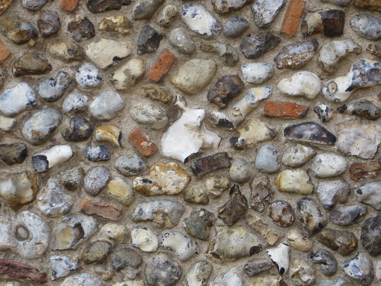
Today in our class tutorial we had a very important lecture about improving our texture work by using 3 different types of mapping, a height map, a normal map and a specular map which is a key skill that game artists need to know about when they are creating a  3D model as well as learning and using the programme 'Crazy Bump'. There was a lot of important things to learn about but I was able to model and keep notes throughout the whole lesson which helped my understanding of what I was doing and I can always use them for future reference.

As it was a long and complicated lesson with lots to learn, a group of my fellow students and I decided to take out our cameras and do some environment photography around Norwich to unwind a little. We were focusing mainly on buildings and textures as our tutor had suggested that they would be useful for us to have when creating our 3D model and for referencing. I do think even just taking a few simple photographs of the cathedral helped me get some structural ideas down which was really helpful so overall the trip was success. I am not too sure if the textures I took photos of I will actually use in this project because they make not fit with my castles theme but I will have to see what I think during the modelling period I can always use them for other modelling project.


Monday, 24 March 2014

Castle Design

Reference Images

Before I started sketching out design ideas that I had in my head, I wanted to do a few more mood boards linking to concepts I have thought about adding into my design. A few of them I probably won't end up doing as they are a little too complex for the level I am on right now or they just don't fit in but I wanted to post these up here in case they do influence my work in any way.

The first couples of mood boards are to do with terrain and the environment around the castle, so I can start planning out where it is going to be placed and fit in with the ocean floor. I like the idea of doing a colourful coral reef but as I am not very strong at 3D I think this is a little out of my league and It would be a  waste of time if I spent hours working on a environment that didn't look good when i could have been working on a castle that looks great. The final 3 mood boards are all about the style I want my castle to be in. I am definitely sticking with the fantasy theme and designing something that is semi realistic. I was thinking about making my castle a ruin which would add a lost and mysterious element to it, or making it a sand castle covered in shells for something more colourful and creative. These are still ideas I am hanging onto for the moment but I am not one hundred per cent sure on keeping.


Research into my idea

Underwater levels in video games

To continue my research on the underwater level I wanted to create, I needed to make sure that my idea would be do able so I decided to have a look into different videos that have previously used a level that caused you to be submerged in the ocean. Luckily I already knew of two video games that I actually owned that would be good examples to look into. I wanted to do this research as I needed to see how other people had modelled an environment such as this.


Tomb Raider Underworld

The first is game I choose was 'Tomb Raider Underworld' as I have been a fan of the series for a long time now and  I knew that right in the beginning of this particular game Lara Croft, the main protagonist is exploring the Mediterranean sea for 'The Path to Avalon' which is a underwater ruin. In this level you are able to swim around a large map as objects such as rocks and sharks loom out of the murky water towards you and you discover hidden treasures. The ocean portrayed here is  quite dark and used basic colouring but still looks effective and make the seen more mysterious.


Alice Madness Returns

The second game is one that I keep mentioning over and over again, which is mainly because it is one of my favourite games and it just has so many references in it that I love to include in my work. The game is 'Alice Madness Returns' and during a large chunk of the it, Alice is driven deeper and deeper into her madness and she enters a imaginary underwater world. Unlike 'Tomb Raider' where you can explore the surface above and below the water, this level is strictly kept beneath the waves. Also this game has far more colourful and eye catching models and characters in a cartoonish style which means that it is possible to create two different styles of underwater environment.


Sunday, 23 March 2014

Design concept

An underwater castle

After looking through all my research for possible castle designs and discussing ideas with my classmates, I realised a lot of the ideas I had thought up were already being done which was a little frustrating as I wanted to do something different from everyone else but there was one idea that I had considered that nobody else had mentioned, and this was creating a underwater castle. The two of the images of this idea I had added to my mood board really stood out for me and were completely different to any of the other concepts which I was really pleased with and I started researching into more of these images right away to make sure I could secure my idea.

The brilliant thing about this kind of design is that there are many different types of concepts I could create stemming from this idea. I have already had a few ideas so far for this design, for example I could create a castle that is made completely out of shells and pieces of a ship wreck collected and built by the people inhabiting the structure, hidden within a large rock crevice. Or I could create a fantasy style castle made out of circular structures that glow with bio luminesce on the side of a rock face with a large bridge linking between two parts of it.

I am aware that this isn't going to be an easy thing to model and I know that 3D isn't my strong suit and I have very little experience with it but I am motivated to work hard and make my design look the best that they can. I think that collecting a large amount of reference images for my ideas will help me with my modelling and also watching a large amount of Maya and UDK videos on YouTube will also help me improve, so this is what I need to move onto now. Bellow are the concept designs I found when I was researching on Google images and I really like the 6th and 7th designs.